...Color Studies??? For real! At the risk of sounding like an infomercial, I must say that color studies have changed my life. They've made painting FUN again! Do you struggle with your final illustrations, wondering if you picked just the right color for that background? Well, wonder no more! With the amazing Color Study, you can try out MANY color palettes in minutes, WITHOUT ruining a nice sheet of expensive paper! Don't believe me? Check out this demonstration!
(*editor's note: I did these color studies by bringing my scanned drawings into Photoshop. I'd put in a color and mess with the hue, saturation, lightness, etc., until it worked. I'll be doing the final illustrations the ol' fashioned way- acrylics- when the time comes.)
So there's an emotionally charged scene in Olympig wherein Boomer is gearing up for a very important dive. I really want to convey a sense of Boomer's fierce determination in the illustration, but HOW to use color to my advantage? I tried a straightforward approach:
 ... or maybe a little red for drama:
 ... Or maybe a more monochromatic, dramatic color palette! Yes, I like this one much better.
 Another fun thing in this process has been using photo references for inspiration. In the grand finale, I wanted Boomer's gymnastics performance to have some (more) high drama and pageantry. What better source of inspiration than the Beijing Olympic and Paralympic opening ceremonies?
  (BTW, can I say I've watched those opening ceremonies about 10 times and I never get tired of them? Yes, even the Parade of Nations- that's my favorite part! Athletes from all over the world coming together, a sense that anything is possible... Gosh, I love the Olympics!! And don't even get me started on kd lang's musical performance at the Vancouver opening ceremonies).
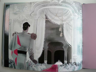
 I also got this great book out from the library: Cinderella, with art from the film's conceptual designer, Mary Blair. Simply beautiful color. I loved the moody atmospheres she created with blues and greens in this piece...
 ... and I experimented with a similar color palette for Boomer's emotional low point.
 (and here are two more pages from that book. So lovely)

Final art for Olympig is due in February, and while part of me is anxious to jump in and start the paintings, I'm going to take the time now to plan out the color for the entire book. Then when I'm finally ready to start I can really concentrate on the drawing aspect- my favorite part- since the color's already been worked out. For the most part!
