Thursday, March 10, 2011

Bye Bye Boomer

Well, the months of swine hibernation are over- Olympig is hoofing its way to New York as we speak!

Lots of people ask me how I deliver my art to my publisher. The answer is pretty easy- I pack it up, and I ship it! Well, I guess a LITTLE more goes into it. I cover each piece with tissue paper (as seen above), and if I have any comments for the art director I'll write those on a sticky note. I also make sure to number each page, to generally note where the crop marks are, and to write my name & contact info on the back of each page.

It seems crazy that this little stack of paper took up so much of my time and attention over the past few months!
As I am a nervous nellie who usually goes back inside at least once before leaving the house- to make sure the oven is turned off, the back door is locked, etc.- you can imagine that it is pretty hard for me to FINALLY admit that everything is done and it's time to wrap things up. Also as a nervous nellie, I wrapped the package in 3 layers of plastic (I DO live in Oregon- what if the package gets rained on?)- then some bubble wrap, and then in a final outer packaging.

One other thing you might notice in the picture above- I included a CD of digital images of all of the pieces. This isn't totally necessary- the publisher will send the original art to China (most likely) to be scanned. However, before doing so the book designer will usually create low-resolution scans (called "fpo"- "for placement only" scans) to make a working copy of the book (called a mechanical) to use in-house for text editing, etc. Since I had already scanned all of the pieces for my own use, I decided to send those files along- to save my publisher some time. And I know it takes a long time, because at Greenwillow I was often the one who created all of the fpo scans for our picture books.

Then a cute little envelope drawing...

... a hefty chunk of change dropped at FedEx, and he's on his way. *Sigh*. I'll admit to feeling some pangs of postpartum depression- my studio looks so empty now. In the coming months I'll talk about what happens between now and the book's actual publication date... but for now, I think I'll sit for a while, staring at the empty walls and remembering The Way Things Were.

Thursday, March 3, 2011

100 Words for Sad

Guess what? Wikipedia just told me that Inuit languages DO NOT, in fact, have 100 words for snow! This is a shame, as I've always liked the idea that you could know something so well that you have 100 words to describe it. Well, I'm still going to use this idea for my blog post, because one shouldn't let truth get in the way of a good story (which, according to Wikipedia, is not a quote from Mark Twain).

It turns out, one of the very hardest paintings in Olympig ended up being this one:

I was kind of surprised when my first- and then a second- attempt at the painting ended up looking awful! I had been excited to paint this one, and I thought it would be pretty easy. After all, I find pictures of people crying to be generally amusing.

But something wasn't working in the paintings. He looked TOO sad, and it wasn't coming across as funny at all. My art director, and some participants in my PNCA class liked his hands up closer to his eyes, so I mucked around with that a bit:


But it just wasn't working. So I sat back to think for a bit. What KIND of crying did I want to portray? With his hands up near his eyes, it suggests Boomer is kind of ashamed of his crying, wants to hide himself a bit- that he's kind of in control of himself. This is not the kind of crying I wanted. I wanted the kind of crying where you're so miserable you don't care who sees it- your arms go limp, your head goes back, and there's nothing to do but cry.

Once I brought a different body language to the sketch, I immediately liked it better.


This ended up being the sketch I used for the final painting. I tried to use every detail I could- his ears, his nostrils, his lips, his chin(s), his shoulders- to portray the quivering, wretched mess he is at this moment.
When you're working in a medium that relies so heavily on pictures to tell the story, it can take a lot of work to be sure you've captured the subtle and nuanced shade of emotion you want to get across. Just as writers labor over choosing exactly the right word, illustrators have to be sure they've chosen exactly the right expression.

Marla Frazee is a master at this. In the illustration below, from her book ROLLER COASTER, she manages to portray every character as excited- but a slightly different kind of excited, depending on the character. The little girl is excited, but still not quite sure if she likes the ride. Her dad is excited, but also nervous about how his daughter is feeling. The elderly couple have been on this ride before (or one like it), and they're having a grand old time. The two macho guys are excited, but have realized the roller coaster is scarier than they anticipated... and so on. Subtle, subtle nuances in their expressions that tell a complete story- despite the very sparse text.


Friday, February 11, 2011

Big Hot Mess paintings

... and why I think they're a good thing!

So, as I'm nearing the end of my Olympig painting journey, I've realized something. I've been painting the book pretty much in sequence, and guess what- all of the hard pages are at the end!! I've had ample time to ponder this. I believe it's because Boomer's story starts out pretty simply- he thinks he just needs to practice hard & he will win a medal- and the paintings are pretty simple to reflect this. As he becomes more frustrated, confused and dramatic, the paintings also become more frustrated, confused and dramatic until they culminate in a Big Hot Mess.


It's kind of scary, and pretty challenging to me to paint these Big Hot Mess paintings. They're not neat and tidy. For much of the process they do just look like a BIG MESS and I get nervous when I remember they actually have to go into a book!

But you know what? When I finally finish these tricky paintings, the messy ones are the ones I like the best. They may not be as slick as some of the cleaner, simpler paintings, but I feel like going through that messy journey gave them some heart.

As you may recall, I also teach children's book illustration at Pacific Northwest College of Art, and we're about halfway through the current course. This past week we talked about one of my favorite subjects: character. I feel like many picture books are written under the pretense that the characters must be "nice" or "good" because they're in a book for children. But really, the characters I love the most are the ones that we're allowed to see at their very worst. The authors and illustrators were not afraid to show us these characters at their messy, pathetic, rock-bottom WORST. Some examples:


Pigeon losing it. Not too classy, Pigeon.

Lilly's mean picture of Mr. Slinger. We've been told how very much Lilly loves Mr. Slinger, and so this picture, and the anger behind it, really does show Lilly at a low point.

Kitten's not necessarily mean or losing her temper here, but she is at a pretty pathetic low point. All she wanted was a bowl of milk- and now she is wet and sad and tired and hungry.

I love these characters- especially Pigeon and Lilly- precisely because we're allowed to follow them into their rabbit holes of bad behavior. They're not perfect because they're in a book for kids. Instead, they have messy, embarrassing, cringe-worthy pathetic breakdowns because they're supposed to be like REAL KIDS. What is WHERE THE WILD THINGS ARE, one of the most beloved books of all time, but a deep exploration of Max's bad behavior? And the fact that these characters emerge intact on the other side- and still loved by their parents- makes them all the more comforting and lovable to us.

My point? I guess it would be- Long live Big Hot Messes!

Monday, January 24, 2011

The Man. The Music. The Muse.

I was perusing my favorite news source this morning (Facebook), and learned an astonishing fact.

FACT: Today is Neil Diamond's 70th birthday!

I found this highly serendipitous, as I have been wanting to write a Neil Diamond post forever! AND, JUST LAST NIGHT my husband suggested I dress as Neil next Halloween! (this was coupled with his brainstorm of a movie idea: The Prince and the Lauper, starring Prince and Cyndi Lauper. This is the kind of quality news item you'll see if you're friends with ME on Facebook).

What does this have to do with children's books, you ask?? PLENTY. You see, Neil Diamond is- in a tradition reaching back to the very beginnings of human creation- my muse.

As I was plotting out the climactic event in Olympig, I knew I wanted the illustrations for those scenes to be big. Show-stopping. There would be spotlights. There would be drama. There would be sequins- oh, there would be sequins. And who better to look to for inspiration than Neil Diamond?


Which leads me into an actual, real topic worthy of a blog post on an illustration site: using photo references for inspiration. I love gathering me some reference photos- in this case, to get ideas about dramatic lighting.

Besides Neil, an obvious source of inspiration for me was the Beijing opening ceremonies. I've mentioned before that color is something that I have to work at. Working from the photos on my (as Martha Stewart might call it) "Inspiration Wall", I can borrow color schemes I like.


Besides lots and lots of photo references, I also keep physical references around when I can. I've mentioned before how I make clay models of my characters.


For Olympig, since he wears a sequined outfit in his grand finale, I thought it important to have some sequins on hand to see how they look in various lights. So I bought a pair of sequin shorts purely for the purposes of artistic study. Solely for that reason and for no other reason whatsoever.


The end result? This is the color study I came up with for the next-to-grand-finale page.

I'm showing the color study and not the final piece here, because it's at an awkward stage just at the moment. More like a bad Lisa Frank Trapper Keeper than the Majesty of Neil Diamond.

But you know what? I'm not worried. With Neil by my side, everything will turn out alright in the end. Happy Birthday, Neil!

Saturday, January 15, 2011

Painting's Progress

Well, my Winter Swine Hibernation is beginning to thaw, I can feel it. I have a handful of paintings left to finish- the Grand Finale climactic scene is next, and that one will be a whopper. Even so, I am starting to feel the itchings of spring. Like, subtle urges to have coffee with friends, for example, or the odd desire to put on some real clothes. I am also being forcibly outed from my winter cave, as my new children's book illustration class at Pacific Northwest College of Art starts on Tuesday! (see a description here). It will be nice to be out and about again (one day a week), and to give my PJs a rest.

Anyhoo, I took some photos of the last painting I did to document the process. I had my sketch & color study done, so I transferred that to my final paper. Those orange scribbles on the back are my transfer method, made using an orange Prismacolor colored pencil (NOT "yellowed orange", but "orange", as my poor beleaguered husband found out the hard way. I felt like a real diva that day- "Are these RED M&Ms I see?!? I SAID NO RED M&Ms!!!!"). Anyway, I take that pencil and cross-hatch all over the back. Then I flip it over, place it on my good paper, & trace the front.

(you can click on all of the pictures for a larger view)


The transfer is pretty good, but I usually add a bit more pencil detail with both the orange Prismacolor & a good old #2.


For this book, I've been outlining most of the illustrations first with a fine brush.


Then, I start blocking in the color! This part usually goes pretty quickly, and tricks me into thinking I'm almost done.


Then it's layers, layers, layers. I keep my paint pretty thin- I tend to lose control of my line work & things get too chunky if I lay the paint on thick. It's a longer process, I think, but it works for me.

The stage from the painting above to the painting below always seems to take the longest. I always find more details that I need to add in! The polka dots on Mama's dress, the stripes on Mr. Hamstring's sportscoat, the flags above the stadium, etc. I'll tell you one thing I've been LOVING to paint- the crowd in the stadium! I'm being for realsies about this, too. Especially as the story progresses towards nighttime- it's been really fun painting the camera flashes & twinkly lights in the stadium. AND... the sequins are about to come out! YES!

And now, back to work!

Saturday, December 25, 2010

Merry Christmas/Slash/Bah Humbug!

No no, I am definitely in the "Merry Christmas" camp, not the "Bah Humbug" camp... EXCEPT when I'm under a tight deadline!! Then I fall into what I call my Bob Cratchit/Uncle Scrooge complex, wherein the two sides of my personality fight for supremacy.

(not shown: the Peruvian blanket on my lap, because like Scrooge I am stingy with the central heating)

My inner dialogue has gone something like this:

U.S.: "I expect you'll want the entire day of Christmas off!"
B.C.: "It's only one day a year, sir."
U.S.: "A fine excuse for robbing a man's pocket every 25th of December! Besides, you have a deadline to meet!"
B.C.: "But sir... it's Christmas!"

My split personality has found a compromise with itself, wherein I let myself work (including writing this) until the afternoon when my wonderful husband is done cooking dinner. Then, it's rest and relaxation!

One of the hardest parts of working for myself has been drawing those boundaries. Working at home, it's easy for me to work work work all the time. But it's important to carve out time for life, like the few days Herm and I took to visit the family in Florida a few weeks ago.

(my beautiful and talented niece- future figure skater and/or star roller derby player!)

Because part of the joy of this lifestyle is supposed to be the opportunity to relax and enjoy life more, right?! So, my best wishes to everyone in this holiday season. May you find time to relax and spend quality time with your loved ones.

And I'll expect you at work all the earlier the next morning! Ha ha.

Sunday, December 19, 2010

Athletics and Me: A History

Guess what time it is?


Roller Derby tryouts time! For those of you keeping track, this will be my third time trying out (once in New York, once in Portland), as chronicled here and here.

It strikes me as funny sometimes that I am involved in something so physical, and also that I'm currently writing and illustrating a book about athletics, since I was anything but athletic as a kid.

I was always gangly & uncoordinated, and just as kids pigeonhole themselves early on as "bad at math" or "bad at art", I always thought I was "bad at sports". I always came in last in the 50-yard dash, and I had a mean PE teacher who clearly favored the boys & naturally athletic girls. No big deal, I thought- I was good at reading and drawing, I did not have to be good at sports.

Appropriately enough, it may very well have been the Olympics that kept me somewhat interested in the world of sports. My mom is a highly creative woman (as evidenced by my homemade costume above), and she was very involved in giving me and my two brothers creative and unique experiences as kids. This includes, but is not limited to, the famed 1984 Block Party Olympics organized by my mother and her best friend, Mrs. C. I wish I had some pictures from this extraordinary event! Staged during our street's summer block party, all of the neighborhood kids competed in events like the marathon (run around the entire block), gymnastics, and a dress-up relay race. We also copied world flags from the encyclopedia with construction paper & staged an Opening and Closing Ceremony parade. The Gymnastics Controversy of 1984 is a story for another day, but I will say this experience influenced me for life. I may not have been naturally gifted at sports, but an athletic competition where we could make flags and have a parade? This was the sporting event for me!


I hope with Olympig (and the accompanying website & additional resources I have planned) that I can help introduce a love of sport to those kids who might not come by it naturally. I know I would be missing a lot by not being involved with roller derby now. Several times a week, I get to hang out with a group of inspirational, strong women- many of whom also never thought of themselves as athletes. Long live sports for the un-athletic!

Oh, and wish me luck at tryouts tonight!!

Saturday, December 4, 2010

Long Time, No Write!

Well hey there! Guess what I've been doing besides not writing on my blog? I'll give you one hint:

PAINTING PIGS.

When you're a children's book author/illustrator, I'll admit it: there are days when my job is prett-ty laid back. I'll watch "Fame" for inspiration, do a little doodling, take a nap & call it a day. And don't get me wrong, I AM working on those days- I fully believe you need to daydream and doodle and spend quality time with your characters.

THEN there is the other part of my job. The dummy is done, art is due in 2 months, and I am painting. ALL. THE. TIME. It's quite different from the sketching in the park part of my job, but you know what? I really like this part, too. It's comforting to know what I'll be doing tomorrow, and the day after that, and the day after that. The irony in all of this is that with all these hours spent at my drawing board, I have plenty of time to think up new blog topics, but no time to write them! Here are some recent topics I've thought of in my piggy solitude:

* Top 10 Things about Working From Home (I got as far as "Leggings" and "Glee" before deciding this might be too damaging to my image)

* A Salute To Creative Parents

* My Dr. Jeckyll/Mr. Hyde Complex: or more appropriately, Mr. Scrooge/Bob Cratchett Complex

* My Imaginary Interview with Ellen (DeGeneres. Wherein I talk about how I am COMPLETELY taken aback by the runaway success of Olympig, and how my good friend JK is helping me deal with the sudden fame. C'mon, hasn't every author had this dream?!?)

So, look forward to some of these topics in the future! Yes, I WILL find the time to write them, because talking to myself on a blog seems less creepy than just normal talking to myself. Have I mentioned I've been spending a LOT of time alone lately??

On to today's topic:

*Finally using images I took for class like 2 months ago!

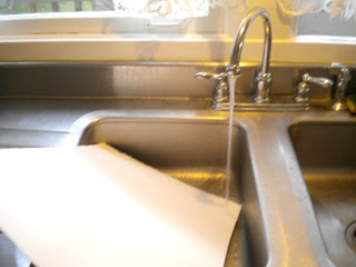
So, I always like to know how other illustrators work. Here, for example, is how I set prepare my paper for my illustrations. It takes a while, but I enjoy the process- I like to imagine I'm one of Michelangelo's little helpers. Preparing my paper with care always feels very artisan to me.

I use acrylics on paper, and the first thing I do with my paper is wet it. Wet it good!

Then I flatten out the paper on a nice thick board. I have several of these boards so I can do a few pages at the same time.
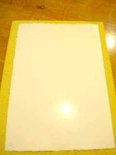
Then, with the paper as flat as I can get it, I take out Bessie the Staple Gun and staple all around the edges.
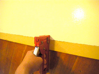
Since the fibers of the paper are nice and wet you can literally stretch the paper, and that's what I do as I go around the edges. When it dries, I want it to be tight as a drum.

Then I take out my gesso.

It's taken me a while to find just the balance that I like, but I've found that a thin layer of gesso with a spongy brush,
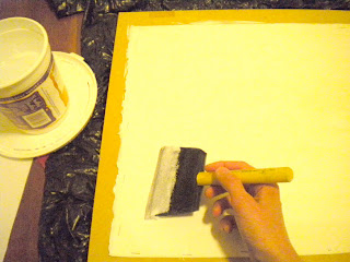
followed by a smoothing with the flat smoothy thing I found in the hardware store
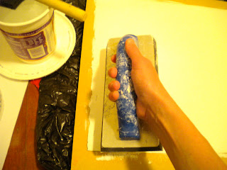
... generally does the trick. I let it dry, sand it down, and repeat the process twice more.
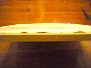
Two things to beware of:

1) Sometimes after wetting & stapling, the paper still looks warped!

Don't panic! I've found it usually smoothes out overnight.
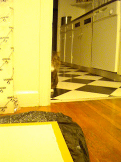
2) Beware of angry cats trying to sabotage your career:


And the last thing about my process that I'll talk about tonight is mixing paint. I'm trying a new thing, which I am really loving- mixing all my colors in advance! It is a wonder! Illustrator extraordinaire Johanna Wright spoke to my illustration class at PNCA this summer, and she said this is how she works, so I thought I'd give it a whirl. And it has changed my life!


So I made color copies of the color studies I did, and mixed my paints to match the colors I already liked. My big question was, How do I know how much color to mix?! My answer: Who knows? For colors I knew I'd use frequently (like "Pig"), I went with "A lot".


I now have tupperware containers labeled "Pig Skin" around my studio, which adds a level of Hannibal Lecter creepiness to my existing "talking to myself" creepiness.

Goodnight, everybody!